A user’s first impression of your website or app will determine whether they will continue through onboarding or exit in seconds. User Experience (UX), or Customer Experience (CX), is the shorthand we use to refer to how users go through your website and app and what you can do to help encourage them to take the intended action. Focusing on a design that mimics valued experiences for users shows that you care, and they’ll often return as repeat customers because they’ll appreciate the experience you’ve provided for them.
Of course, to optimize UX, there are a lot of moving parts to consider, with many of them happening simultaneously. Everything is connected, and you cannot optimize one thing while ignoring the rest. You should keep in mind where the user is coming from, who they are, what they saw before your product, and why they are visiting/using your digital product. It’s a lot to keep track of, but it is worth the effort.
Why it matters
- 57% of mobile shoppers will leave if the website loads more than 3 seconds, and you probably already paid for that customer to go to your site. So you want a fast, responsive website.
- 8 out of 10 people are willing to pay more for a better User Experience, so why not give them a better UX?
- A well-conceived, frictionless UX design could improve conversion rates by up to 400%, and optimized e-commerce websites have seen 70% more products sold, with a 30% increase in sales.
As you can see, and the list of reasons and affected KPIs goes on,—UX is important! To help navigate this tricky but fascinating element of marketing, we’re going to dig deep in a three-part series, including a guide on how to keep on top of changing trends in user behavior and a detailed look at how to conduct your own website health check. To begin with, though, we will outline some general best practices and provide concrete examples to help you see how UX functions in action. Ready? Let’s dive in.
Increase motivation and decrease anxiety
Two of the main principles you want to keep in mind when addressing your UX are the following:
Valuable: Is it functional, enjoyable, and easy to use? Successful products usually have a little spark and shareability.
Usable: Your goal should be for each screen to be self-evident so that just by looking at it, the average user can say, “I get it.”
Essentially, you want to be working toward the goal of increasing motivation and decreasing anxiety. And if you think this is starting to sound more like a psychology class than a lesson in website development—well, that’s kind of the point.
Like many things in the world of UX, though, there is no one size fits all approach. Reducing friction to increase conversions can, in some cases, be a flawed tactic. Although there remains a widely-referenced best practice that, if you make it easier for people to convert, more of them will—there are scenarios where friction is actually good for conversions.
As summarized effectively by Venture Harbour:
“Remove all friction from any page, and you’re looking at a blank screen with nothing but a form on it – but that’s not going to convert.”
Booking.com
Similarly, the balance between motivation and anxiety doesn’t always function in the same way. A great example is Booking.com.
They were one of the first companies that had a dedicated team looking at conversion rate optimization and neuroscientific behaviors—as in, examining how cognitive loading and cognitive biases help with (or hinder) decision making.
Their current UX reflects that although you don’t necessarily want people to hurry when visiting your site, sometimes you need to create a fake sense of urgency to get them to take action. They came up with this “x number of people are looking at this now” or “only x number of rooms left, book now!”. As a cognitive bias, it could, in theory, lead to stress and, therefore, to an abandonment of intent to purchase. In the case of Booking.com, though, they have struck just the right balance to stimulate motivation to book.

Airbnb
We see these same principles of motivation vs. anxiety playing out differently on websites like Airbnb—which focus on achieving the goal in as few clicks as possible. Unlike other shopping examples, where it can take a lot of clicking to find what you’re looking for, Airbnb has narrowed it down to three simple points: where, when, who. Here you can find more reasons why Airbnb is successful with UX, by maximizing information, minimizing the steps, and giving direct positive feedback. Therefore, they can lead people down their conversion funnel very quickly and effortlessly (= good UX).
Amazon
Amazon has also capitalized on this strategy with their ‘direct-buy’ option. Although their business model prevents them from having a straightforward landing page (so many options to click on), they’ve differentiated themselves by making it easy for return users to buy any number of things by following a straightforward process that avoids the burden (and opportunity for second-guessing) of repeatedly entering payment info. By prompting users to create an account and save payment details, they’ve managed to get the clicks needed to make a purchase essentially down to one.
So, although they function in different ways, all of these websites have good UX and understand cognitive friction in terms of decision making and what the user is there to do.

Empathize with the user and give them a reason to act
An additional two elements that are critical to UX success are:
Useful: Be relevant. Why would people buy your product, visit your website, or use your application?
Desirable: Do people want it? The image and brand should provoke an emotional response. Think of premium brands charging a higher price because of this.
Effective UX also considers who your primary audience is and what you want them to do. You need to understand their needs, wants, and motivation and reflect that in your website and ads. For example, suppose the user uses particular terms, such as “visiting New York,” and you direct them to a generic info page where they once again have to state the place they would like to get information about. In that case, you’re in trouble as a website—this increases user frustration, and they are likely to bounce. Users should never have to repeat themselves. That is lousy UX because it would have saved the user time if it was already filled in. It also diminishes motivation.
Understand the crucial steps at each stage of the process
As stated above—the intent should always be the focus. You need to anticipate user wants and needs as they move through the UX process if you’re going to have any hope of influencing behavior. Keep the following principle in mind:
Findable: Make things easy to find in places users are used to (like the search bar at the top).
Accessible: Maximize your user group. Can someone with disabilities do the same interactions or see elements the same way?
Understanding all the behaviors that need to occur at a particular step in the process will allow you to make them more readily available for all users. This includes colorblind and visually (partial or fully) impaired. Of course, not every user will engage in the same way, and good UX accounts for this divergent behavior.
For example, the recommendations page should be multi-purpose—a person who wants to buy directly should be able to do so. On the other hand, if someone else wants to read more, they shouldn’t have to load a new page to get that information. Similarly, if someone wants to compare, they should be able to do so automatically.
Understand what your users can do at all stages of the customer journey—interacting, browsing, understanding products, comparing, and ultimately buying—and provide them with relevant info at each stage. In other words, don’t show elements that might be confusing at too early of a stage. The payment details, for example—method, security, shipping, guarantees, return policy, etc.—should only be presented when someone is ready to buy.
(This is the universal icon for accessibility on websites.)
Quality Assurance: Make sure that your website works
Finally, the importance of functionality cannot be overstated. To make your product effective, you should test your website/app regularly.
Take a “recent” personal example as something to avoid. I wanted to order dumplings but, after getting to the purchase step, was unable to click confirm on mobile as the window was too big for my screen size, and it was not responsive, so I literally could not buy. I’m sure it would have worked on desktop, but I was on the go and wanted to place my order immediately. This problem could obviously have been avoided if the developers had checked that what they deployed actually worked. Here some video examples of my recent experiences (note: the dumplings website has fixed the issue by now after some user feedback ;-))
These errors seem obvious when given clear-cut examples, but they can be surprisingly easy to overlook. Other things to avoid include:
- Small texts that are impossible to read on a phone.
- Photos that you can’t zoom in on.
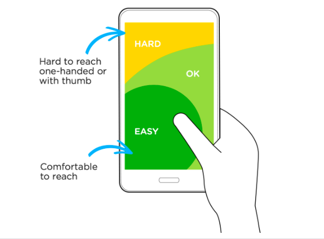
- Having CTAs or clickable buttons too close to one another (in UX, there is a thick thumb principle—everyone needs to be able to click comfortably without accidentally clicking on another element that is too close to the intended one).
- Having clickable elements on mobile at the top of the screen (where they are hard to reach). They should be ideally on the lower part, where your thumbs can reach easier.
Apple, for example, used to have its keyboard configured so that it only worked well with two thumbs. They came to realize in 2017 that people were looking to be able to type with one hand, though. Therefore, they changed the design so that it could be aligned for either right or left-handed people. That is UX optimization—to understand what users need, QA it, and make sure it works on the devices people are actually using.
(Photo: LUKEW — https://www.lukew.com/ff/entry.asp?1927)
A constantly evolving field of knowledge and behavior
As you can see, UX principles are relatively intuitive once you get the hang of them—but the fact that there are so many moving parts to account for means you need an organized and proactive approach. Moreover, the way we use technology is constantly changing, and therefore best practices in UX are similarly always in flux. By conducting regular UX checks, though, you’ll be able to significantly increase retention, conversion, revenue.
Get in touch with one of our experts to learn more and stay tuned for more UX guides regarding how to keep on top of changing trends in user behavior and a more detailed look at how to conduct your own website health check.
Likewise, if you’d like to stay up to date on current social media trends and growth marketing hacks, follow us on LinkedIn, Facebook, and Twitter for the latest digital marketing news.


